
Beyond the curve: Dr. Peter Lurie's COVID-19 blog
There’s been no more ardent an advocate of opening up state economies than Georgia Governor Brian Kemp. So ardent, in fact, that he even earned the scorn of President Trump for opening too soon. Now that takes some doing.
But, even as we wait to see if the state’s reopening generates a burgeoning number of new coronavirus cases, the state has found itself in a fracas of its own making. On May 10, the state Department of Public Health posted the following graph on its website.
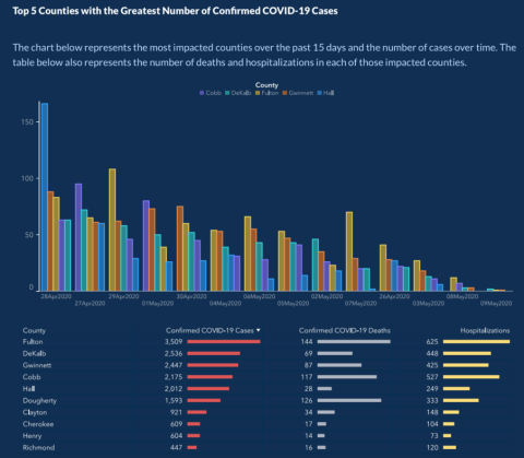
At first impression, one can discern the basis for the Governor’s decision: a downward trend in cases in the five most impacted counties over time.
Not so fast! Last time I looked at the calendar, April 27 preceded April 28 and every day in May came after every day in April. Not so in Georgia, apparently. And the five counties leap-frog over each other from day to day so that they’re ordered from highest to lowest number of cases, combining with the scrambled calendar to convey an exaggerated notion of downward trends.
OK, I’ve been in public health for like three decades and I’ve never seen a graph portray data that way. And I promise you, I’d remember.
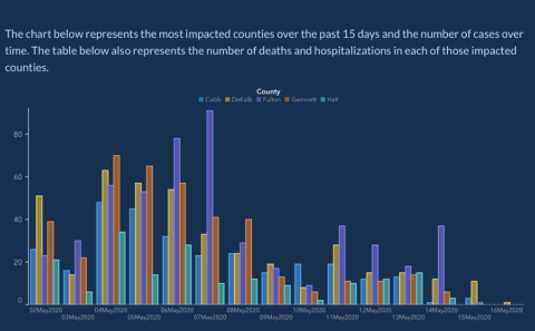
All credit to Stephen Fowler, a reporter for the radio station GPB News, and State Rep. Scott Holcomb, who pointed out the gaffe and forced the Department to correct the graphic by the next day. Here’s a revised version from the state. This presentation hints that the cases may be declining, but certainly not nearly as much or as consistently as suggested by the original graph. (The truly detail-oriented will note that the data cover somewhat different periods, although they mostly overlap, and that there are minor differences in the counties’ daily caseloads, presumably due to updating or lags in reporting. But this was all we had access to, and none of it diminishes the larger point.)
As state governments are wont to do, the Governor’s office blamed it on a vendor.
But, to tell you the truth, I still can’t really tell what the heck is going on, even in the second graph. The better way to present the data would be to separate the counties and have the daily number of cases appear chronologically for each.
So we eyeballed the data from the second graph (we didn’t have access to the raw numbers), leaving out the last couple of days for which the data appear to be sparse, yielding the following depiction.
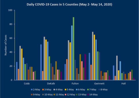
This version makes a suggestive case for a decline, though generally for less than a week and by varying amounts in different counties. But, as much as anything, one is struck by how much the county data vary from day to day, making it hazardous to draw strong conclusions based on these short-term trends and highlighting the challenge of making data-driven decisions about whether and when to reopen in real time.
I’m actually willing to cut Georgia a little slack here. With modern technology, data can be reordered with a keystroke. But it’s a well-worn truism that when the data tell the story you’re trying to convey – apparently even when that involves reimagining the Gregorian calendar – you’re less likely to notice an error.
This blog was produced with the assistance of Eva Greenthal.
Contact Info: Contact us at cspinews[at]cspinet.org with questions, ideas, or suggested topics.